My first (this) website
Putting my front-end and user experience skills to use.
I made this website to serve as a much needed portfolio for myself. I also wanted to get building with the HTML and CSS I had learnt, and teach myself more about modern, responsive layouts in the process. This lead me to study some Bootstrap and Flexbox as well. Responsive columns, collapsible menu and perfectly centered elements were a breeze after that!
(Beginner tip: Want to look at the code that’s running the website you’re on? Open it on Google Chrome, right click and choose “inspect”.)

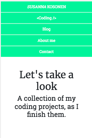
This is what my menu looked like on mobile before the toggle option (and color change). No wonder hamburger menus are everywhere!
You’ll notice I went for a simple look, with cooler colors to go with my pictures. I wanted to make the website fully responsive, so you’d have a nice experience with any phone or device you’re using. Images are optimized for web performance ( = they’re small in filesize, to put it simply), which will, together with a clear content and HTML hierarchy, help with the SEO of my page. This is a fairly common looking website, which could be varied to suit small businesses or other portfolios.
All in all, this website is designed to deliver a nice, easy and intuitive user experience for you, whether you want to learn more about coding (just like me!) or you want to know more about me and my projects. What do you think? I’m constantly working on this website, so feedback or other comments are welcome!